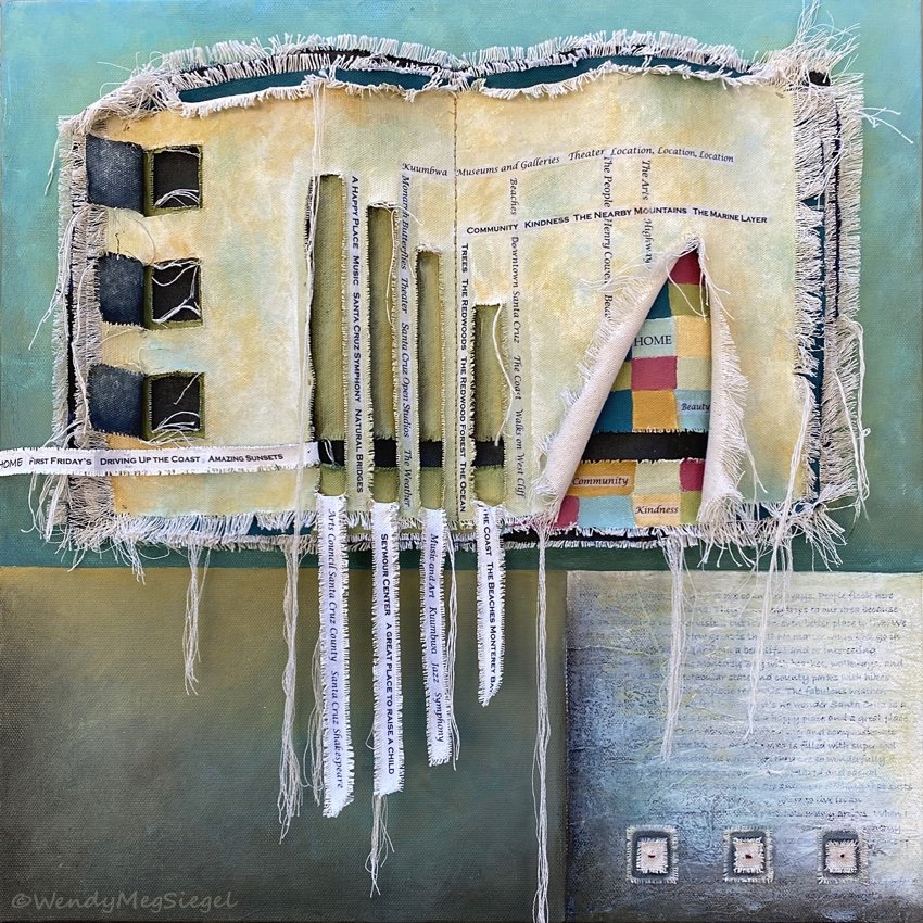
Completion Stage: Putting the Pieces Together
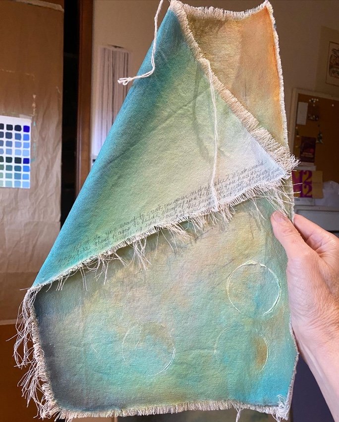
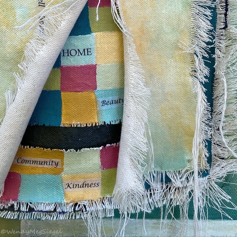
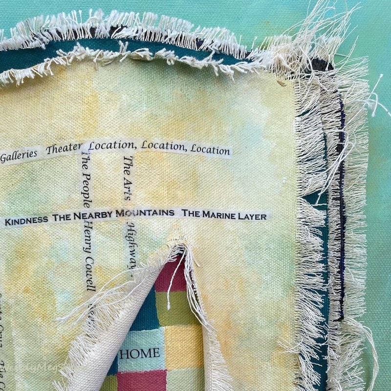
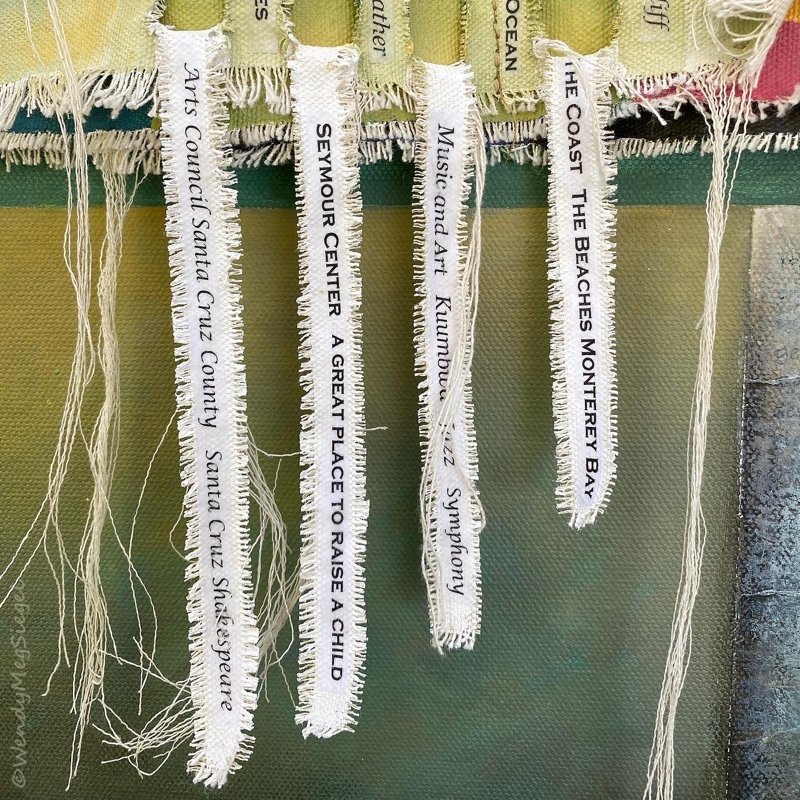
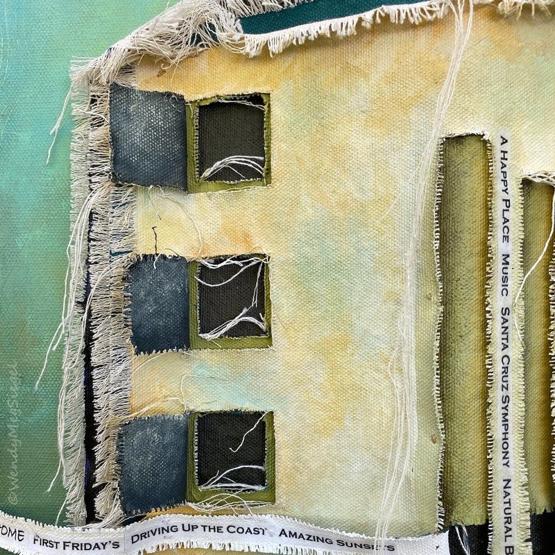
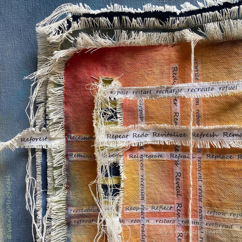
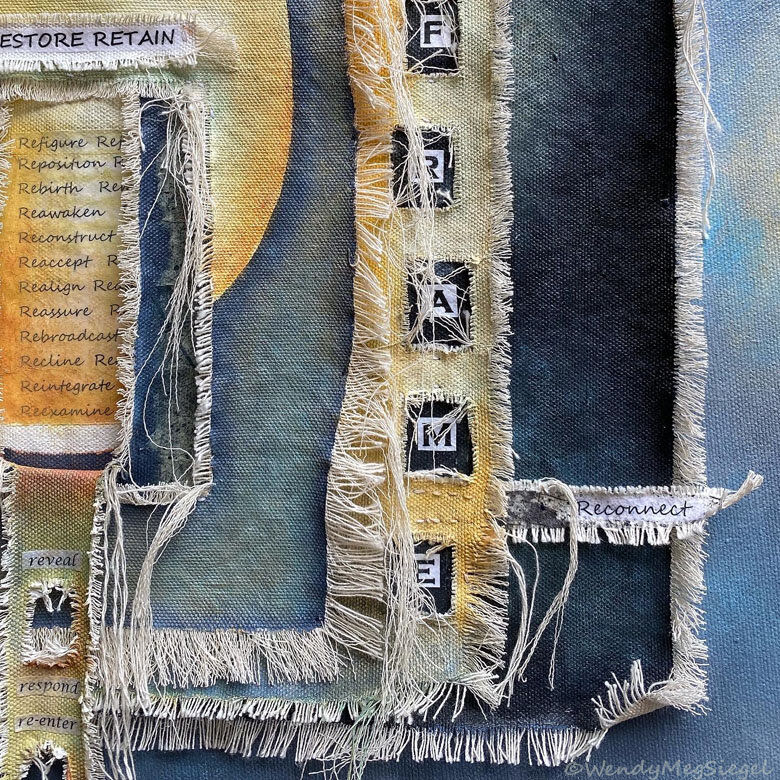
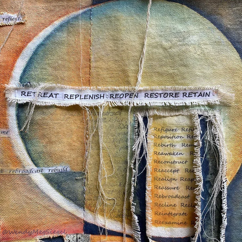
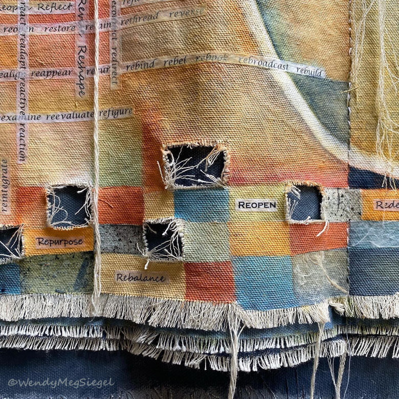
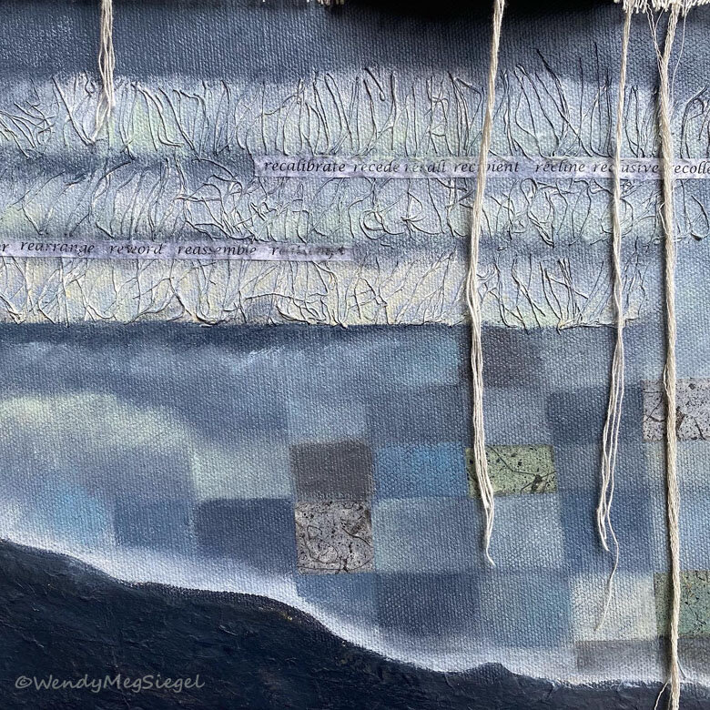
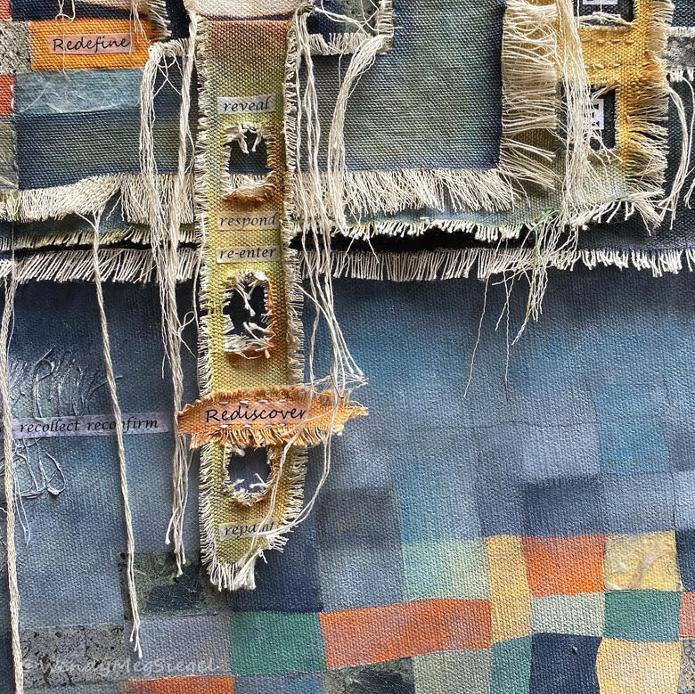
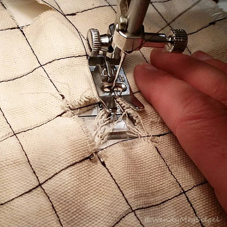
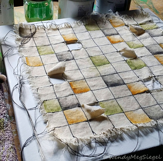
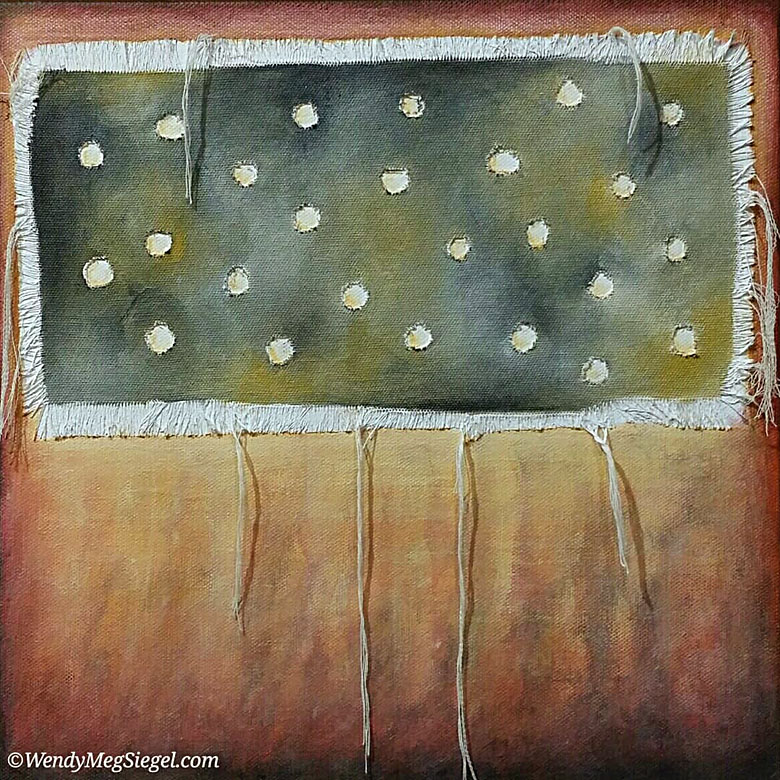
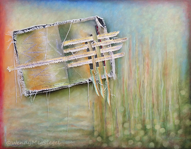
This stage of the process is such a delight and so fulfilling. It usually begins by laying out all of the separate elements, together, on the stretched canvas background, finalizing their placement, and sewing the cloth layers in place. Any additional text is now adhered to the painting where ever it seems to fit best.

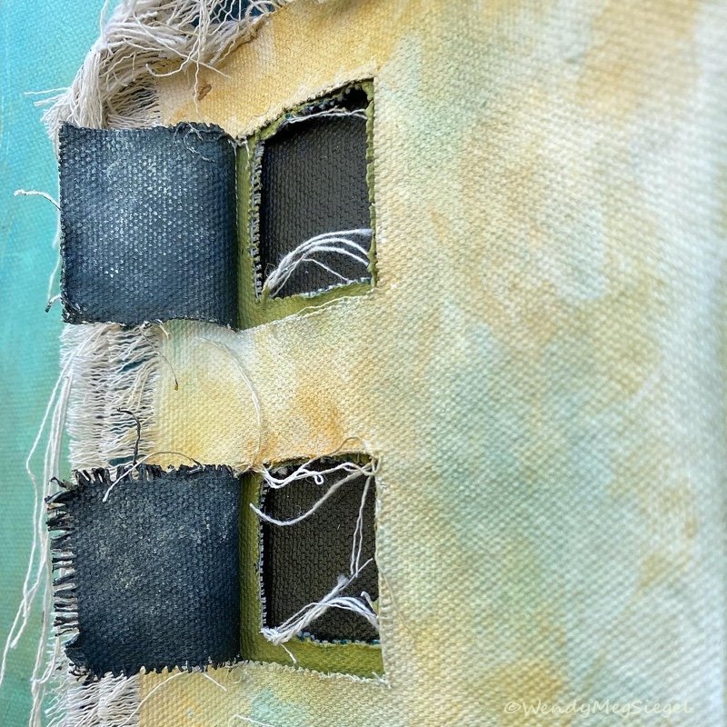
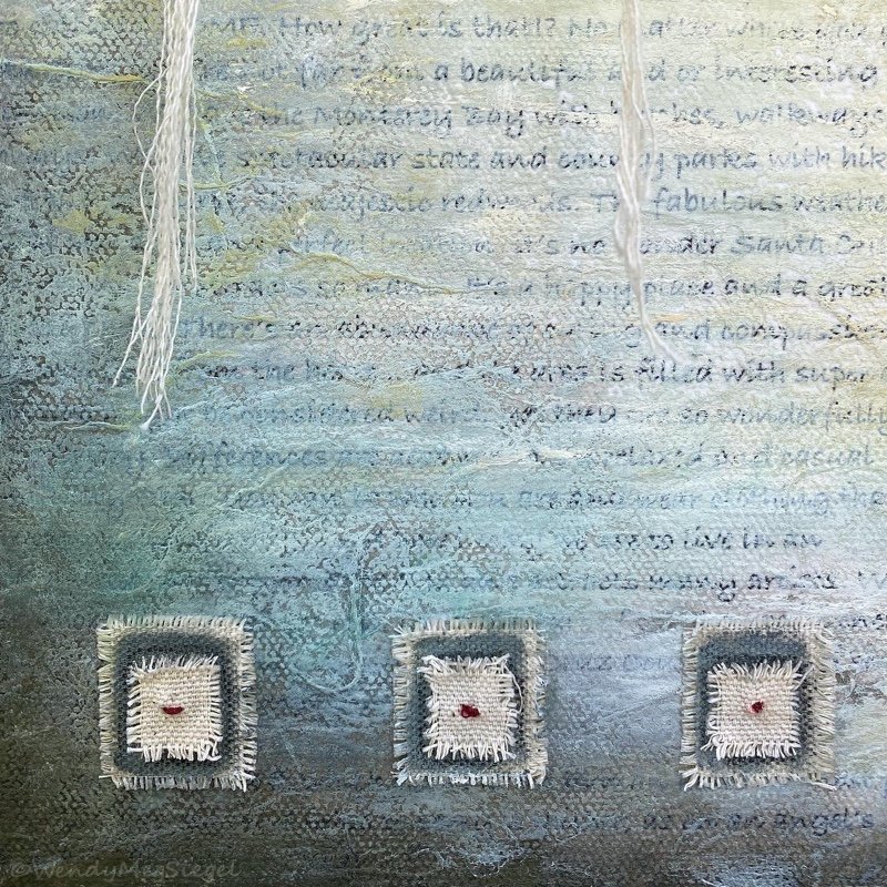
Once all of the parts are solidly in place, the painting is ready to be made whole. In other words, it’s time to cohesify the painting. Everything has been prepared and painted in parts, and now they need to come together as one cohesive painting, rather than a collection of disjointed elements.
It’s a joyful experience that feels like starting fresh but with a structure already in place. I become lit up with ways to tweak the color here or create a shadow there, determining, “What else is needed?” “What areas to darken or lighten.” and “What alterations to make.“ I am truly in my happy place as I watch the painting transform in bits, as little alterations add to the whole.
From inception to completion, the process of creating a painting is a joyful experience. Every part of the process has it’s gifts and delights. One of the greatest gifts is being able to be present for each of the stages, moment by moment, along the way.
This was part 4 of a 4 part series. Links to the first 3 are below.

You may also be interested in…
Before I Begin - Part 1
The Beginning Stage - Part 2
The Development Stage - Part 3