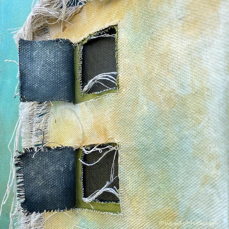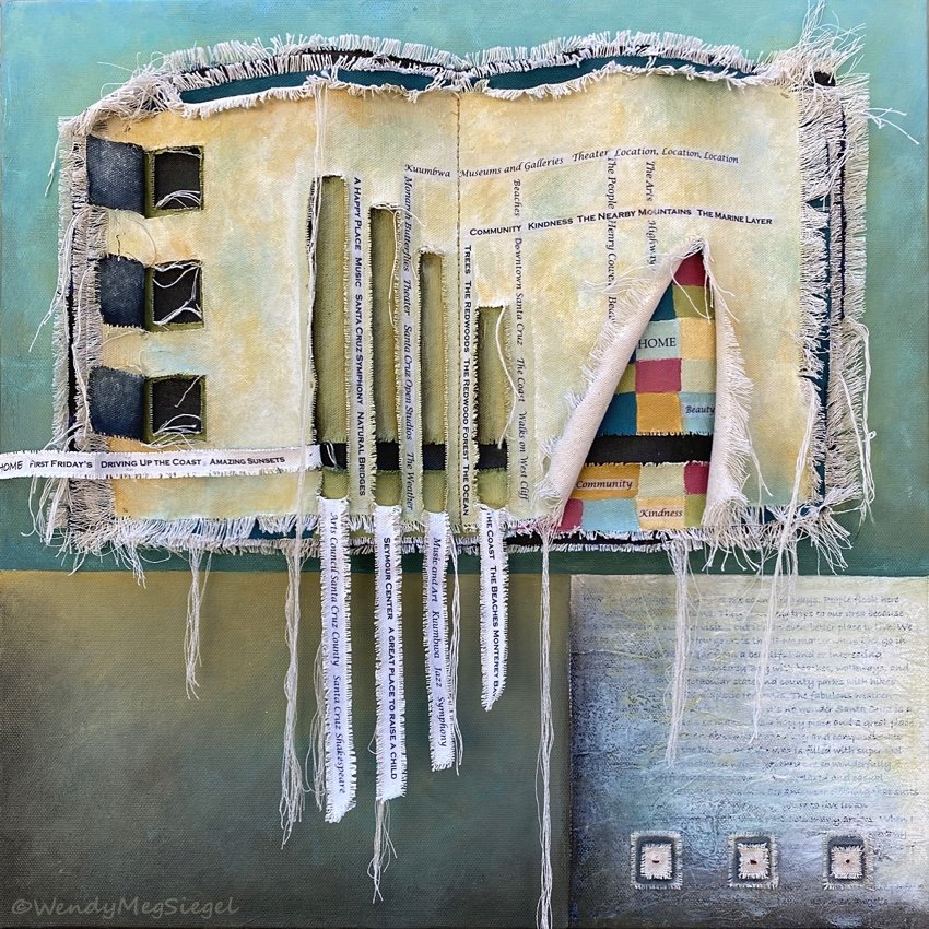
“Santa Cruz Love Note" 18" x 18" Acrylic, cloth, papers, strings, and threads on canvas.
“Santa cruz love note” is currently hanging in a Local show.
Here are the details:
Exhibit: Local Visions
at: Pajaro valley arts
(pvarts.org)
When: Now until July 31, 2022
Opening reception:
Sunday, June 26
From 2PM - 4PM

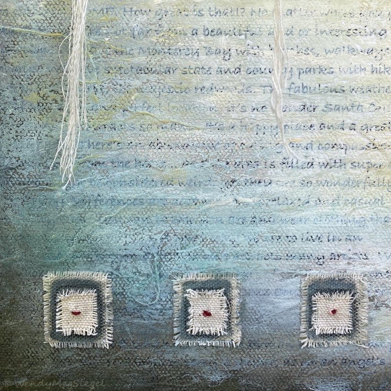
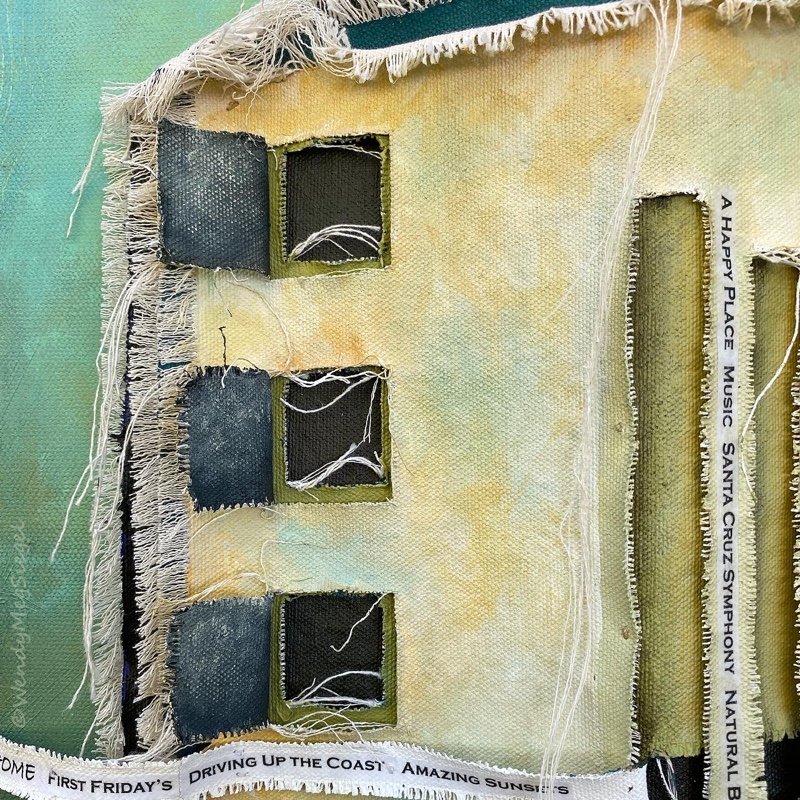
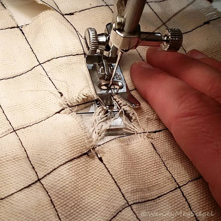
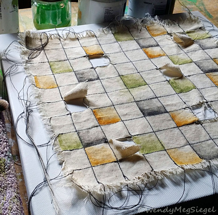
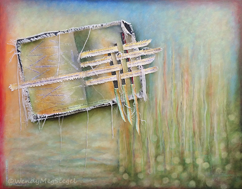
"Santa Cruz Love Note” in process
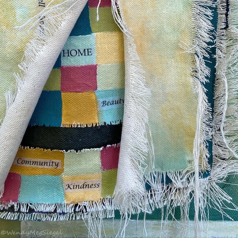
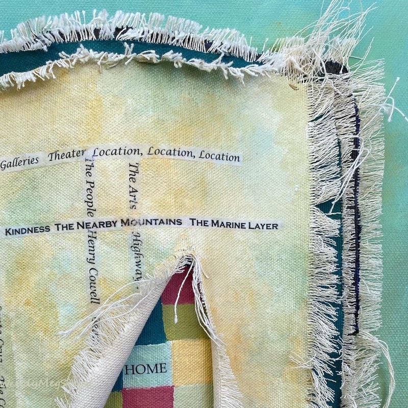
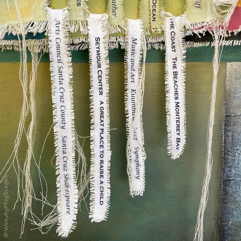
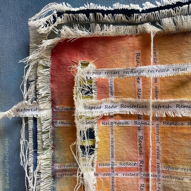
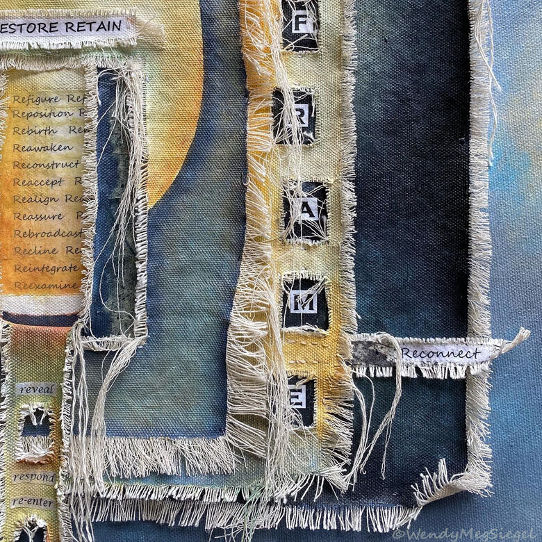
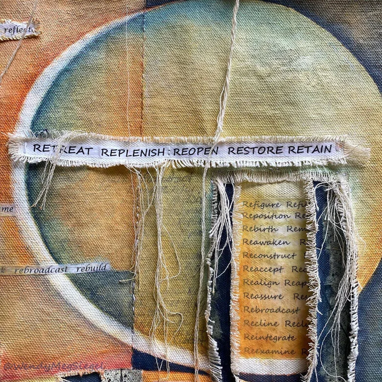
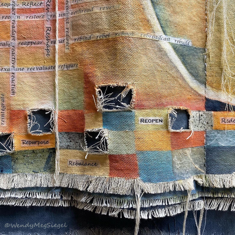
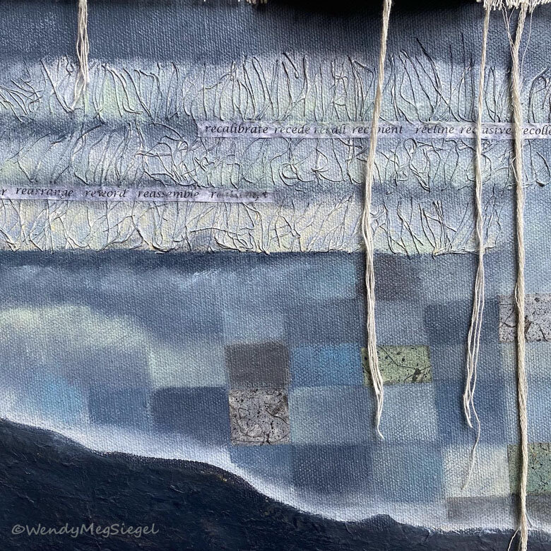
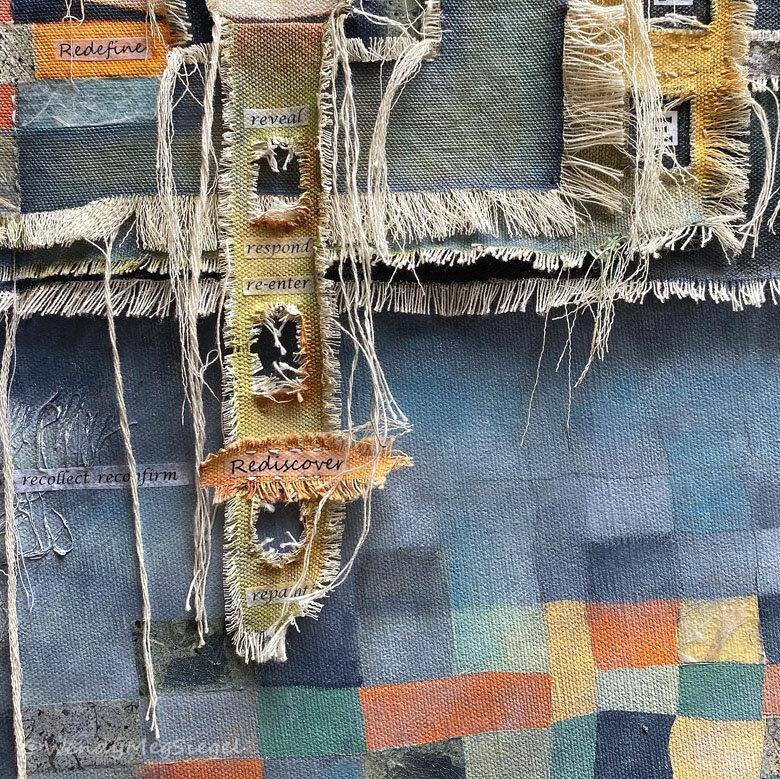
I created “Santa Cruz Love Note” specifically for the Local Visions show at Pajaro Valley Arts, a membership exhibit. We were told to have fun with the theme and that’s exactly what I did. I filled the painting and layers of raw canvas with the many things I love about living here in Santa Cruz. And I could have added even more. In the lower right hand corner of the painting, I’ve attached something of a love note about the area. These words are somewhat visible under the paint.

Pajaro Valley Arts
For those of you who are unfamiliar with Santa Cruz, it’s a happy place, surrounded by natural beauty. There’s plenty to love about Santa Cruz County… with the magnificent redwoods, the hiking trails, the forests, the coast, the beaches, the arts, the people, the culture, the beauty, and so much more. Since I began developing this painting, my appreciation for the area has continues to grow.
Gallery Information:
37 Sudden Street, Watsonville, CA
Gallery Hours: 11.00am – 4:00pm
Wednesday-Sunday
Masks Encouraged
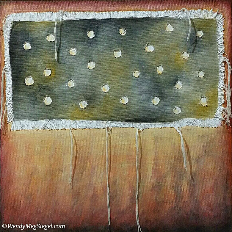
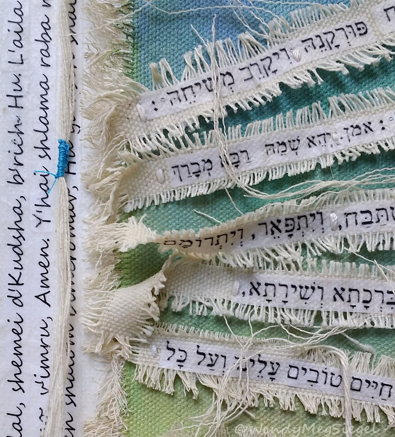
Here are some details of the completed painting: