canvas art

My Painting Process - Part 3

The Development Stage…

The middle stages in developing a painting primarily involve adding paint, creating the text to be included, making any revisions in the prepared cloth pieces, and considering any other elements I might want to add to the painting.  

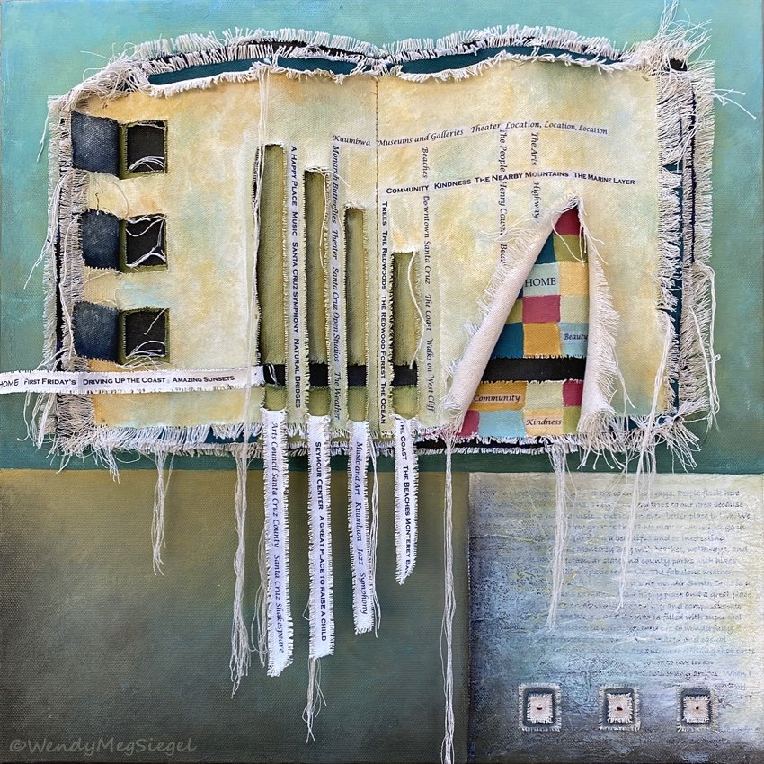
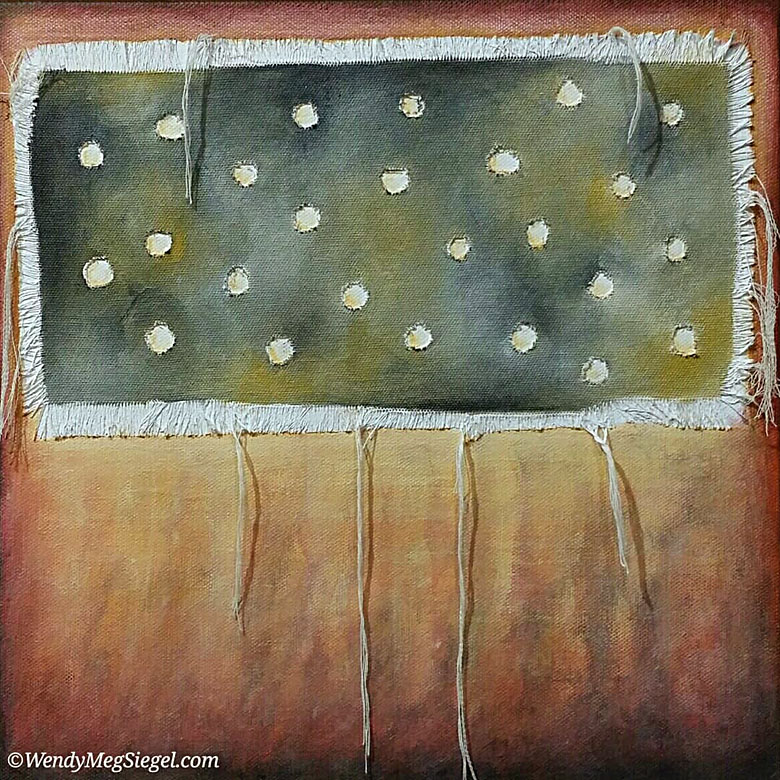
I can get lost in the joy of playing with paint on the stretched canvas… adding colors, lightening areas, darkening others, thinking of how I want the background to show up around the cloth elements. In some paintings I take my time with this painting stage, just to continue enjoying the process.

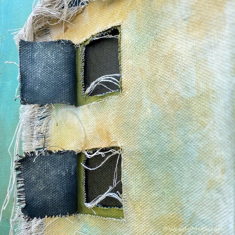
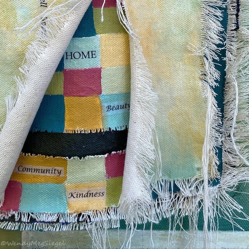
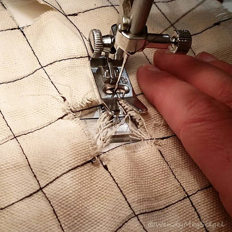
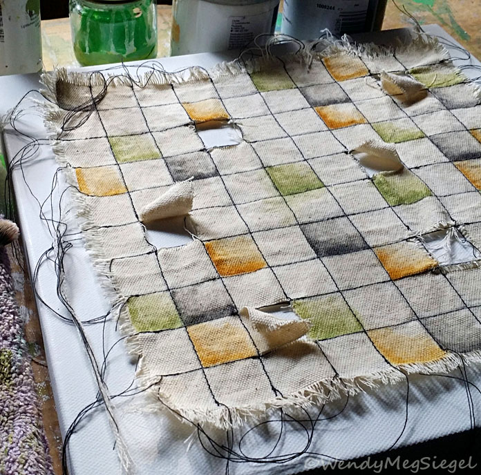
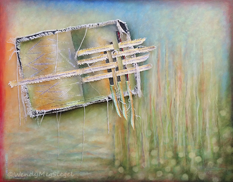
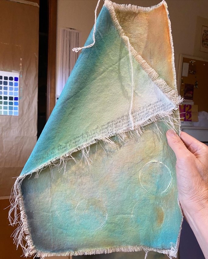
Once I feel clearer about how the cloth pieces will fit within the whole, I give them their first layer of paint. There are times I prefer the raw look, and will choose to leave them coated but unpainted. 

Although the background of stretched canvas and the layers of cloth develop separately, they keep coming together to help clarify what each one requires in order to fit within the whole. It’s during this stage when it becomes clear if the painting would be better served with a different cloth construction… and a new one is prepared.

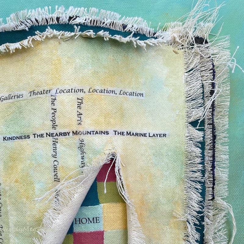
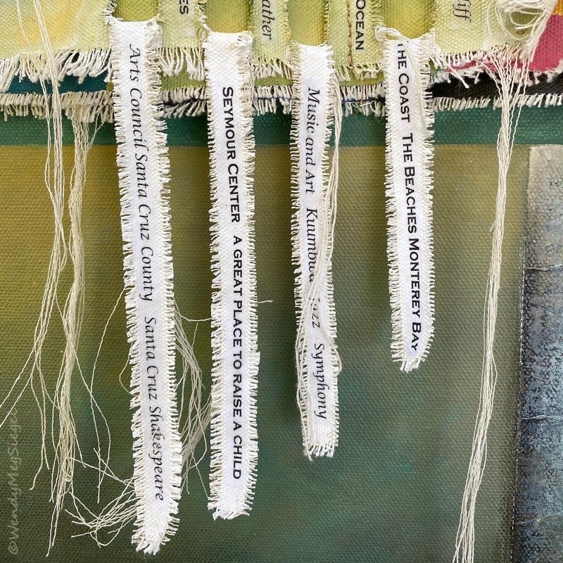
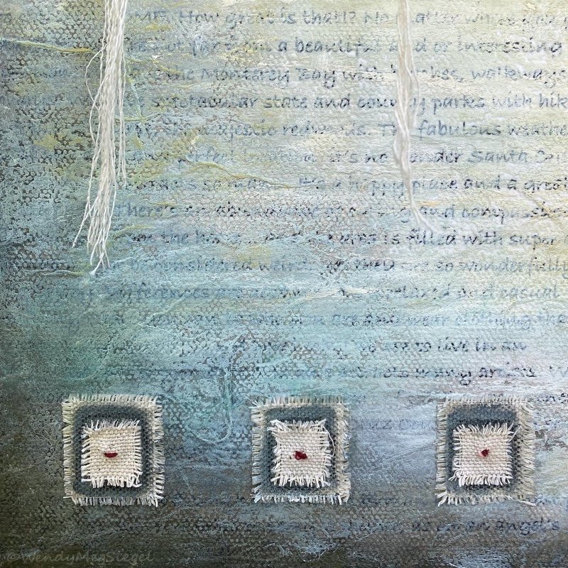
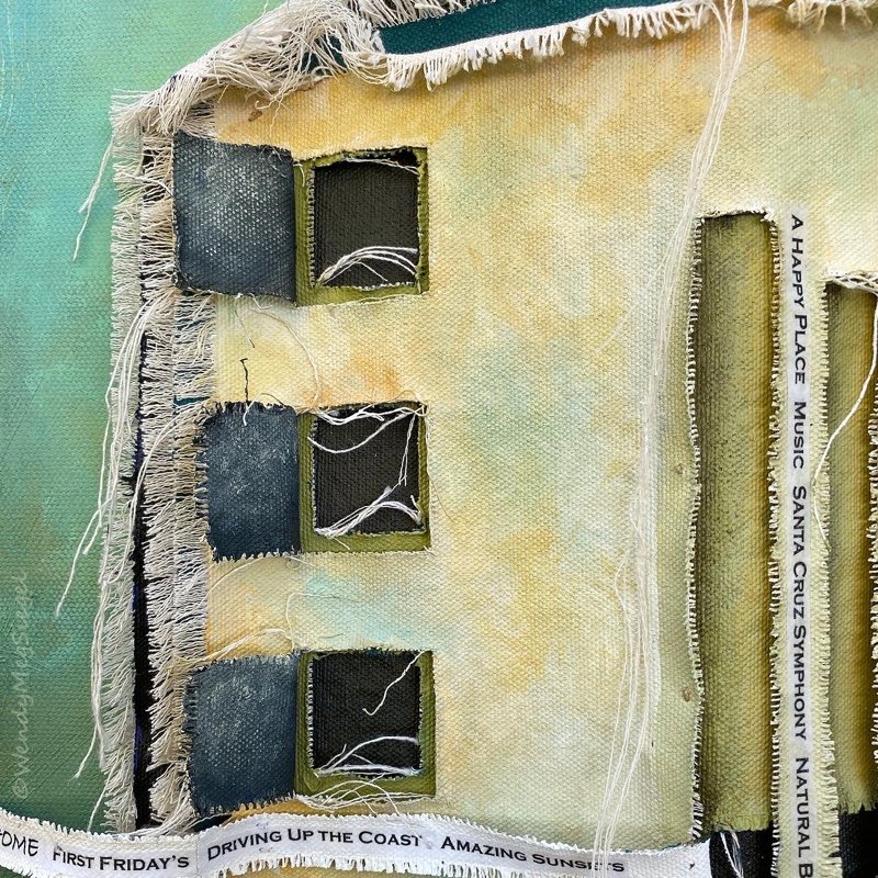
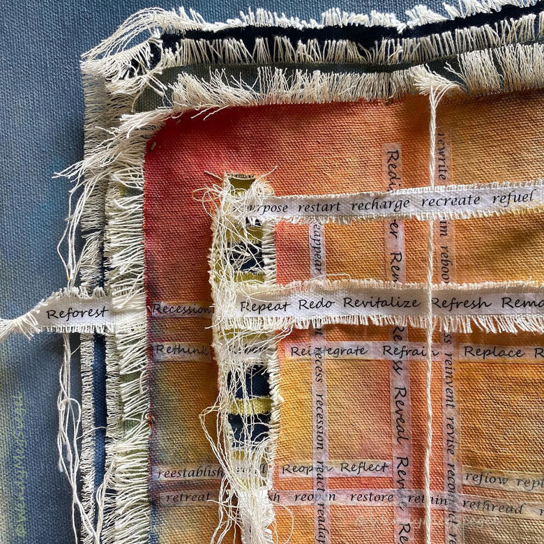
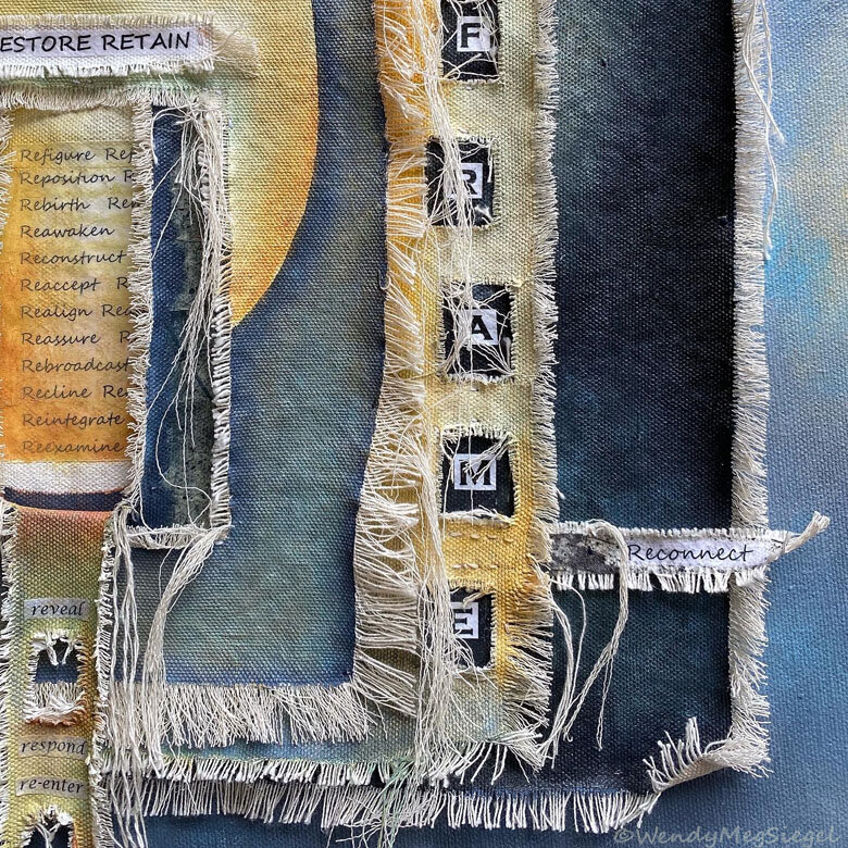
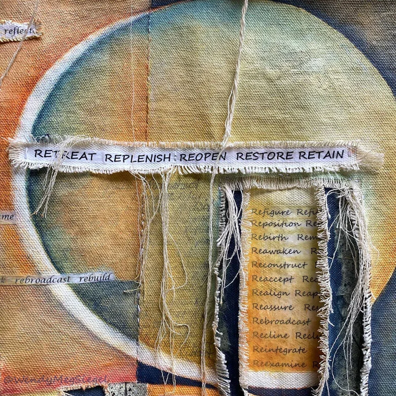
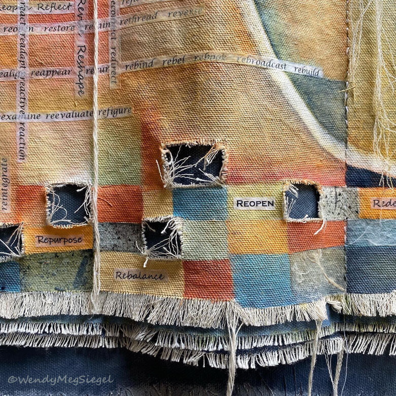
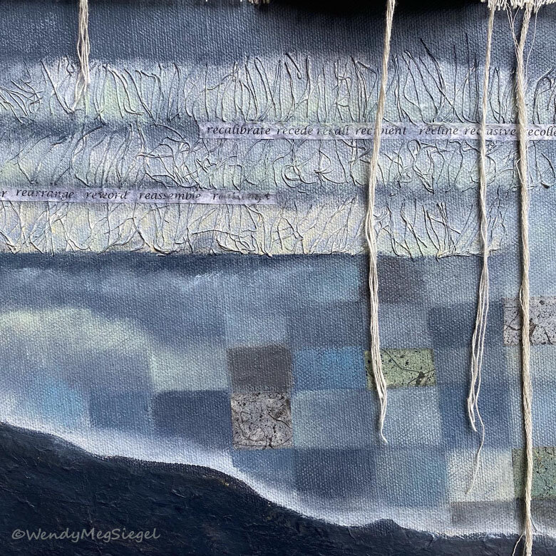
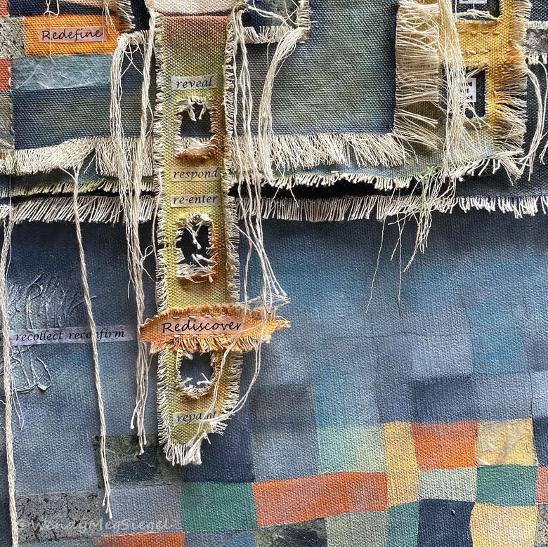
Up until this point I’ve considered the words I’d like to include in the painting. The concept and meaning behind the painting has developed within my mind and I am ready to produce the text in different sizes and sometimes in a variety of fonts to be printed. The placement of text on the painting becomes a super enjoyable game. Since I print more text than I will use, I have a multitude of choices as I move the strips of words from place to place. Decisions on the placement of text may lead to adding new layers of cloth to house the text.

More to come. This is part 3 of a 4 part series.

Next up… Putting the Pieces Together - Part 4

You may also be interested in…
Before I Begin - Part 1
The Beginning Stage - Part 2

My Painting Process - Part 2

Beginning stages…

I often begin a painting by covering the blank canvas with color. There’s so much freedom and joy in the feeling of a paint filled brush on the stretched canvas. It never gets old. There’s a wonderful ebb and flow to the dance between the brush and canvas, a give and take. Part of the fun is in placing dabs of multiple paint colors on the canvas and mixing them right there with the movement of the brush. The first coat of paint is pure play, with a definite awareness that anything placed on the canvas can be covered up, so at this point, nothing feels precious.

Another early stage of the process is in the construction of raw canvas pieces to fit the paintings concept or focus. This involves cutting, fraying, and stringifying them to size. But before I can do all that, I have to have a sense, and something of a vision, of the layout of the pieces within the whole. The prepared piece(s) help me to get moving forward on the painting and get a feel for the whole. They act as a place holder within the painting as it develops, but may not be the final piece(s) that end up in that particular painting. Many cloth pieces, created for one painting, have ended up in another, or on the pieces in waiting pile.

I love the beginning stages of a new painting… the flow and freedom of creating the first layer of color on the canvas, the feel of the cloth’s texture between my fingers, the pile of strings that develop as I pull the threads from the cloth to create the fringes. It could be thought of as the best part of the creative process, but for me, there are many best parts that take place as the painting’s process develops.

More to come. This is part 2 of a 4 part series.

Next up… The Development Stage - Part 3

You may be interested in:
Before I Begin - Part 1

My Painting Process - Part 1

I’m here to share my process in creating a painting. Although there can be similarities in the way other artists work, every artist has their own steps, details, and experiences in creating their very individual and original works of art. I’ve decided to share mine in a series of 4 blogposts, broken down into 4 stages, to be shared over the next several weeks. I’ll be focusing on the steps in developing a Canvas-on-Canvas painting.

This will be a general overview of the process, although one size doesn’t necessarily fit all of my paintings. I begin Part 1 of the series by describing what commonly takes place before I even begin a painting.

Before I Begin:

Before I put paint to canvas, I often get an idea… it could be a vision, a title, or concept of something that zings me. No matter what it is that jump starts the creative flow, I am sparked by a desire to express something I find meaningful. 

Often, once the concept begins to take up residence within my thoughts, I begin to get a feel for the colors to use in that painting. It’s not that I’m trying to come up with a palette, although that does happen occasionally. It’s more of a feeling sense of the colors that come to me. I guess it’s hard to explain how I might feel the colors but I do believe I feel them first and then get a subtle visual, as if I’m seeing the colors through a mist and from afar. However misty, there’s a sense of clarity on a specific color palette to begin with, and I am able to have the paints at the ready before I get to work.

There have been a few times in which I’ve used my collection of painted color swatches to choose the palette. Although I find it to be fun to play with the many choices, the process feels a bit clunky and awkward. The color flow ends up feeling a bit less natural.

This is the first part of a 4 part series.

You may be interested in:
The Beginning Stage - Part 2
The Development Stage - Part 3

Santa Cruz Love Note

“Santa Cruz Love Note" 18" x 18" Acrylic, cloth, papers, strings, and threads on canvas.

“Santa cruz love note” is currently hanging in a Local show.

Here are the details:

Exhibit: Local Visions
at: Pajaro valley arts
(
pvarts.org)

When: Now until July 31, 2022

Opening reception:
Sunday, June 26
From 2PM - 4PM

"Santa Cruz Love Note” in process

I created “Santa Cruz Love Note” specifically for the Local Visions show at Pajaro Valley Arts, a membership exhibit. We were told to have fun with the theme and that’s exactly what I did. I filled the painting and layers of raw canvas with the many things I love about living here in Santa Cruz. And I could have added even more. In the lower right hand corner of the painting, I’ve attached something of a love note about the area. These words are somewhat visible under the paint.

Pajaro Valley Arts

For those of you who are unfamiliar with Santa Cruz, it’s a happy place, surrounded by natural beauty. There’s plenty to love about Santa Cruz County… with the magnificent redwoods, the hiking trails, the forests, the coast, the beaches, the arts, the people, the culture, the beauty, and so much more. Since I began developing this painting, my appreciation for the area has continues to grow.

Gallery Information:
37 Sudden Street, Watsonville, CA
Gallery Hours: 11.00am – 4:00pm
Wednesday-Sunday
Masks Encouraged

Here are some details of the completed painting:

2020 Reframed

“2020 Reframed" 24" x 24" Acrylic, cloth, papers, strings, and threads on canvas.

“2020 Reframed” has been accepted into the MAH’s upcoming exhibit.

Exhibit: In These Uncertain Times
at the Santa Cruz Museum of Art and History (MAH)
beginning on January 15, 2021

2020 is no ordinary year… filled with layers of challenges and unlike any we’ve experienced. Early in the year, I started to notice an unusual presence of RE-WORDS showing up in my life and in the world around me. I am referring to an abundance of words beginning with the letters RE. (Retreat, rediscover, recreate, reinvent, recover...) It’s been a year in which we’ve all had reasons to RE-vise our plans, RE-assess our priorities, and RE-define our lives. We have waited for businesses to RE-open and wondered if and when we might RE-turn to “normal.”

"2020 Reframed” in process

Back in May, I created a RE-WORDS concertina sketchbook, an eight page book built to highlight these words. Once it was completed, I felt a strong need to continue working on this project, but in a larger format. So I printed my collection of re-words in different fonts and sizes and began constructing a painting. “2020 Reframed” is loaded with words appearing on layers and strips of raw canvas. The prepared layers have been stitched together and are sewn onto a 24” x 24” stretched canvas. The loose threads and textures further represent a time in which our personal and societal threads have been laid bare.

Here are some details of the completed painting:

AND not long after the completion of this painting, a new word emerged: RE-population. It’s used when fire evacuees are returned to their homes. (Luckier than many, we are very thankful to have had a home to return to.)

Breath and Beyond

“Breath and Beyond” 12" x 12" acrylic, cloth, threads, and paper on canvas.

“Breath and Beyond” 12" x 12" acrylic, cloth, threads, and paper on canvas.

“Breath and Beyond” was the first painting I worked on and completed after returning from packing up my parent’s home. (We were getting it ready for sale.) Although I returned with several new projects in mind, I decided to get busy with the raw canvas I had prepared before leaving. My first goal was to create a thread filled environment in which to paint.

“Breath and Beyond” in process.

“Breath and Beyond” in process.

I began by sewing lines of stitches in something of a checkerboard pattern, leaving loose threads at the ends of each line. I had already cut five squares into the cloth before the trip.

“Breath and Beyond” didn’t develop as I had originally envisioned. So, I let go, allowing the process to lead me, and I was able to enjoy every step along the way.

I kept adding color, then some text, and then more color. The background canvas became a deep brownish mauve to peek through the openings in the cloth.

The text in the painting is the mantra, So Hum, meaning: "I Am That." It is used in meditation as one focuses on their breath.

“Breath and Beyond” in process.

“Breath and Beyond” in process.

I always have a title in mind by the time a painting is complete… but not this time. The painting had journeyed so far from the original idea and I felt like I was just along for the ride, not knowing where we were going. I had to brainstorm ideas for a name.

When the title, “Breath and Beyond” came to mind, I knew it was right. I could see how the painted cloth had become a tapestry OR a tapestry of life. I had chosen a mantra that represents the breath OR breath of life. And the cutouts had become windows to the beyond.

Breath and Beyond is available for purchase, here.

“Breath and Beyond” in process. Sewing the painted cloth to the back canvas.

“Breath and Beyond” in process. Sewing the painted cloth to the back canvas.

Small Bites

Small Bites 12" x 12" acrylic and cloth on canvas.

Small Bites 12" x 12" acrylic and cloth on canvas.

A dream became the inspiration for Small Bites… an original painting that is now part of my Canvas on Canvas series. First I prepared the piece of raw canvas by fraying the edges and cutting out holes in the cloth. I attached it to the stretched canvas and then it was time to take out the acrylics and brushes and choose some colors.

Small Bites in process. Choosing the color palette.

Small Bites in process. Choosing the color palette.

Choosing the color palette:

I only had a vague idea of the colors I would use. So, I began with one of my favorite starter color palettes: yellow oxide, titanium white, and Payne’s grey. (Oh, but since I have very little Payne's grey around, I'm using ivory black.) I love the way these colors mix together!

Now I had to choose the rest of the colors. I have a small collection of color cards that I’ve created and add to from time to time. I find it very helpful in choosing a color palette when I don't have one immediately in mind. I went back and forth on different color ideas for this one.

It took me a while to get comfortable with the reds I had chosen, but I really like the idea of stretching my “color comfort zone.” And by the time I was finished, I had grown much more comfortable with the reds in this color palette. (0f course, I did soften the intensity of the color, somewhat.)

Small Bites is available for purchase, here.

Twas Brillig

“Twas Brillig” 24” x 30” Acrylic, canvas cloth, and paper on canvas.

“Twas Brillig” 24” x 30” Acrylic, canvas cloth, and paper on canvas.

Detail image of “Twas Brillig”

Detail image of “Twas Brillig”

Painting brings me joy. I love my time in the studio and the relationship I develop with each of my creations… but once and awhile I create something that significantly increases the joy. “Twas Brillig” did just that. It turned up the “Joy Meter” and I was in no rush to complete it. I found myself savoring every moment I spent playing with this canvas.

For years I have wanted to create a painting with a focus on Lewis Carroll’s, Jabberwocky. I have loved it since high school. In fact, in one of my art classes back then, we had to illustrate a children’s book for a painting and drawing class. I chose to illustrate The Jabberwocky. (Thank you, Mr. Foo)

Closeup of the attached book on “Twas Brillig”

Closeup of the attached book on “Twas Brillig”

I so enjoyed playing with the text of the poem as I incorporated Carroll’s unique and wonderful words into the constructed cloth book. I took my time developing the background of the stretched canvas that became the setting for the “book.” This one gave me an opportunity to explore with color and structure.

Detail image of “Twas Brillig”

Detail image of “Twas Brillig”

My original goal was to, in some way, allow the words of Lewis Carroll to spill from the book, as if the boundaries of the books could not contain it. I would love to do more canvases like this one. Playing with text as it pours from the painting surface. These are the types of images that keep coming up in my mind, calling to be created.

I enjoyed every moment I spent on this painting. And I can’t help but wonder if this one may be something of a bridge between the work that has come before and the artwork I will be creating, moving forward. I definitely approached the painting process differently than I might have in the past… and that had been my goal.

Here are the words of the first and last stanzas of the poem for those of you unfamiliar with Jabberwocky, by Lewis Carroll and for those who would enjoy a reread:

’Twas brillig, and the slithy toves
Did gyre and gimble in the wabe:
All mimsy were the borogoves,
And the mome raths outgrabe.”

Twas Brillig is available for purchase, here.